Uhuru Personally Tweets from an Android device; Raila insists on Change, so his iPad says (Part 1).

Its exactly 21 days to presidential elections in Kenya and  being Kenyan gives me the chance to rewrite this with some level of confidence the data way. The leading contenders for the top seat are arguably Uhuru Kenyatta and Raila Odinga. This  led me to look at whether their tweeting patterns and content depict how Kenyans perceive them to be. Part 1 of this article focuses solely on Uhuru Kenyatta.

Data science is fast gaining momentum in the field of politics. I chose the same path to look how leaders and those to be tweet in Kenya. Are they as abrasive as they are in political rallies or are there tonal variations especially when online?

Data set collection is always the first point to get to. What other better platform provided the experimental space than Twitter. Kenya sure enough is a hotbed of social media exchanges, more so KOT. I collected tweets on Uhuru Kenyatta’s timeline via my Twitter apps development keys which totaled to 184 tweets which I converted to a data frame for easier manipulation in terms of conversion to vector format etc. Sample output is as below:-

Tweetsample_Kenyatta

Tweeting sources are primarily three as the handle @UKenyatta disseminates tweets from Android, iPad and Web Client devices. Our interest is in accurate identification of which device Uhuru Kenyatta personally tweets from of the three sources. This is hard but possible as it can be attributed to the tweeting times as well as the content(a bit hard). We therefore assume that either Uhurus’ campaign team tweets from either of two devices as the assumption is that Uhuru tweets personally on the other remaining device. Tweeting times as in the below graph point show that “he” actually tweets from an android device when the tweeting times are factored in. “He” tweets quite early in the morning  and the rate goes down in the afternoons and starts tweeting again late at night. Tweets from the iPad and Web Client are dominant late mornings and afternoons. They fizzle out at night. This proves the assumption that “he” may just be the twitterer on the android device.

tweeting_times_uk

I used tidytext R package to clean the dataset as tweets are noisy in nature. Removal of stop words, lemmatization as well as removal of numerals among others were carried out. Overall common word occurances in the entire corpus are summarized below:-word_co_occurances_uk

Another dimension supporting our assumption that “he” tweets from an Android device is the absence of attached images from his Android device vis a vis the web client and iPad. An infographic view of the same paints a better picture of this assumption.

pictures_per_account

Another dimension of  interest is in the choice of words from the UKenyatta account based on the source. I therefore looked at the likelihood of words from the different accounts converging or simply a measure of commonality between the terms.  We’ll consider which words were most common from Uhuru’s android device relative to the iPad as we’ve established “he” may just be tweeting personally from the android one.  The best way to measure this is by calculating the log odds ratio for each word relative to the two data sources (Android and iPad). Formula is as below:-

log2((No. in Android+1/Total No. Android+1)/(No.in iPad+1/Total No. in iPad+1))

Its  basically the number of a certain term in the android sourced set over the total number of words from android source. The same is replicated for the iPad. Comparisons are done for both the web client source in comparison with android source as well as iPad.

Overall its a bit hard to clearly distinguish the tone bearing in mind most of the tweets focus on the campaign thus the disparity between the three sources is NOT clear-cut content-wise.


Sentiment Analysis: Anything of concern?

We’ll also look at the words as per the sources and their associated emotions. NRC Word-Emotion Association lexicon is the preferred place to make the associations. The lexicon attaches words with 10 sentiments namely anticipation, positive, negative, anger,disgust, fear, joy, sadness, surprise, and trust.

To measure the sentiments in the two sources, we count the words in relation to the sentiments in the NRC lexicon. A sample output is below:-

source              sentiment    total_words words
<chr>                 <chr>                      <int> <dbl>
1 Android         anger                       246      7
2 Android         anticipation           246      15
3 Android         disgust                    246       3
4 Android         fear                          246       8
5 Android         joy                            246       19
6 Android         negative                  246       10

What about the looking at how emotionally charged terms are in Android sourced tweets (Uhuru Kenyatta’s) vs those from the iPad( Assumption: Uhurus online team)? A poisson test can be used to measure this difference in sentiments at 95% confidence interval. The output is as below:-

emotions_uhuru

Disgust is dominant in Uhuru’s Android account tweets as well as anger and sadness compared to the those from his iPad. This is an interesting observation as emotions are explicitly expressed in the Android account.

Part 2 of the post will be on Raila Odinga and whether he really tweets from his iPad and whether he is an emotionally charged person or not.

Whatsapp or Wechat: The Bigger Elephant in the room

I have been writing about Data Science and its applications for some time now as that’s the primary goal of this website. I have taken some time away from writing the past month and concentrated on academic work. I will put my findings here once done. Hope they be worth it. Back to the topic in question.
Many would argue that Whatsapp is the biggest messaging tool in the world primarily because of the diverse population using it. Some would argue about numbers using Wechat being superior. I believe I’m better placed eliciting some of the differences since I have equally used both and lived in  environments where their usage is maximized.

Notable Features on Wechat:
1. Silent Playing a Video  – When you are in a quiet place without earphones.
2. Wechat wallet – Ability to book your Rail/Flight or order Taxi via the App,connect to your bank account, buy a movie ticket, order food etc.


3.Clarity in Video and Voice Calling –  Wechat is clearer under same conditions compared to Whatsapp.
4. Wechat Moments – Share real-time videos for your friends to see.
5. Integrating 3rd party applications to the platform.
6. Location Detection i.e. Real-time view as well as finding people nearby.

nearby.png
7. Official Accounts
8. Popular with users in China.
9. Ability to create groups of maximum 500 people.
Notable Features on Whatsapp:
1. Wider reach as its popular worldwide.
2. Ability to make video and voice calls.
3. Ability to form groups of at most 100 people. Not very sure if this changed.

The two tools are almost similar in their interfaces and design. Some people find it easier to use Whatsapp especially if their friends etc are spread all over the world. It’s a popular tool at least out of China. The Chinese I’m sure wouldn’t trade anything for Wechat. Wechat is very powerful compared to Whatsapp especially in the tasks it can accomplish. I may sound a little biased but any day or time I would go for Wechat if all my friends had Wechat accounts. On the hindsight, Wechat occupies more phone memory and its bandwidth usage is also quite high compared to Whatsapp. Its all about one choosing what is best for him or her.

Followers Sycophancy or Love. A data approach towards Uhurus and Railas 2013-2014 sentiments.

Merry Christmas. I had an article up last week regarding the performance of Kenya Airways when it comes customer feedback.  I decided to change tune this week and look at some unstructured data from an unsupervised perspective.  Kenya being my country still gives me a better perspective to view what’s happening there from a data perspective.

This led me to look at what Kenyan leaders have been putting up online since March 2013 when general elections were held, all the way to  31st December 2014. I have all the data up to 2016 but saw it better to analyze it in bits to have a better view of the changes to their narratives over the years. They will often update their followers(fans) mostly on what they are up to or events at the time. This gave us a platform to look at whether what they write about resonates well with the electorates or they differ in opinions. Does it mean their fans just follow them blindly or raise conflicting opinions to the leaders’ sentiments?  I realized that people are more honest when they willingly write about something affecting them at the time it happens. There was, therefore, a high chance of obtaining accurate information at such times compared to say information collected from surveys more so with structured and leading questions. I focused on facebook posts by arguably the top two political leaders in Kenya; Uhuru Kenyatta and Raila Odinga.  Uhuru Kenyatta’s  page at the time had more followers compared to Raila Odinga’s.. A summary of the pages’ statistics at the different times is as below:-

4th March 2013 – 31st Dec 2013
Name Position Page Statistics Top 3 Follower Countries
Uhuru Kenyatta President – JUBILEE party leader Total Page Likes:2,548,144
No  of posts:408
FB Posts Likes:1,318,437
Shares:78,237
Kenya: 2,015,595
Tanzania:125,530
Uganda:84,303
Raila Odinga Leader of Official opposition – CORD party leader Total Page Likes:549,316
No of posts:189
FB Posts Likes:313,792
Shares:25,535
Kenya:489,141
Tanzania:18,568
Uganda:9,334
                                                                1st Jan 2014 – 31st Dec 2014
Uhuru Kenyatta President – JUBILEE party leader Total Page Likes:2,550,929
No  of posts:371
FB Posts Likes:2,926,675
Shares:263,950
Kenya:2,017,664
Tanzania:125,833
Uganda:84,341
Raila Odinga Leader of Official opposition – CORD party leader Total Page Likes:549,316
No of posts:139
FB Posts Likes:138,942
Shares:7,087
Kenya:89,141
Tanzania:18,568
Uganda:9,334

Data Collection and Processing

Just like in this article, the tool of choice remained R.   I found one exceptional application called Facebook application called Netvizz that I used in scraping data from the two pages. It gets all the network data from Facebook pages quite well, especially on a fast network.  A deeper network involves crawling all the comments etc which takes quite a while compared to just getting the posts of the two alone. I was also interested in the fans/followers comments so had to go the deeper way.

We’ll, therefore, go ahead and look at how I manipulated the data.  Our focal library remains the text mining one i.e. library(tm).

Loading required NLP packages.

> library(tm)
Loading required package: NLP
> library(SnowballC)
> library(wordcloud)

Loading the 2013 and 2014 datasets.

> uhuru2013 = readLines("F:\\New Data-Facebook\\Uhuru+odinga\\Uhuru_2013-03-04_31-12-2013.txt")
> raila2013 = readLines("F:\\New Data-Facebook\\Uhuru+odinga\\Raila_20130304_20131231.txt")
> uhurufans2013 = readLines("F:\\New Data-Facebook\\Uhuru+odinga\\Fans_2013-03-04_31-12-2013_uhuru.txt") 
> railafans2013 = readLines("F:\\New Data-Facebook\\Uhuru+odinga\\Fans_20130304_20131231_raila.txt")
> raila2014 = readLines("F:\\New Data-Facebook\\Uhuru+odinga\\Raila_20140101_20140530.txt")
> uhuru2014 = readLines("F:\\New Data-Facebook\\Uhuru+odinga\\Uhuru_20140101_to_20141231.txt")
> uhurufans2014 = readLines("F:\\New Data-Facebook\\Uhuru+odinga\\Fans_20140101_20141231_uhuru.txt") 
> railafans2014 = readLines("F:\\New Data-Facebook\\Uhuru+odinga\\Fans_20140101_2014121_raila.txt")

The data had to be cleaned and if you read the article on Kenya Airways, then you must be aware of the below function. I encapsulated all operations on the datasets in one function so that all I needed to do was to apply the function on the datasets and they will be cleaned up and converted to matrix form for further manipulations.

> analyseText = function(text_to_analyse){
CorpusTranscript = Corpus(VectorSource(text_to_analyse))
CorpusTranscript = tm_map(CorpusTranscript, content_transformer(tolower), lazy = T)
CorpusTranscript = tm_map(CorpusTranscript, PlainTextDocument, lazy = T)
CorpusTranscript = tm_map(CorpusTranscript, removePunctuation)
CorpusTranscript = tm_map(CorpusTranscript, removeWords, stopwords("english"))
CorpusTranscript = DocumentTermMatrix(CorpusTranscript)
CorpusTranscript = removeSparseTerms(CorpusTranscript, 0.97) # keeps a matrix 97% sparse
CorpusTranscript = as.data.frame(as.matrix(CorpusTranscript))
colnames(CorpusTranscript) = make.names(colnames(CorpusTranscript))
return(CorpusTranscript)}

I then applied the function on the six datasets.

> uhuru2013_words = analyseText(uhuru2013)
> raila2013_words = analyseText(raila2013)
> uhurufans2013_words = analyseText(uhurufans2013)
> railafans2013_words = analyseText(railafans2013)
> uhurufans2014_words = analyseText(uhurufans2014)
> railafans2014_words = analyseText(railafans2014)
> raila2014_words = analyseText(raila2014)
> uhuru2014_words = analyseText(uhuru2014)

Since the datasets represented views of different entities, I deemed it fit to load them as separate documents  i.e. Uhuru/Raila posts as well as that of their fans for the two years. That made it easy to see the change in the narratives over time as well as draw comparisons on what related entities shared.

I then needed to compute the frequency or summation of individual words in the matrices to know what words were used most. This drove us to know what exactly the three entities spent their largest amount of time talking about. This procedure was done of course after cleaning up and removing stop words in the dataset.

> freq_uhuru2013_words = colSums(uhuru2013_words)
> freq_raila2013_words = colSums(raila2013_words)
> freq_raila2014_words = colSums(raila2014_words)
> freq_uhuru2014_words = colSums(uhuru2014_words)
> freq_raila2014_words = freq_raila2014_words[order(freq_raila2014_words[0:30], decreasing = T)]
> freq_uhuru2014_words = freq_uhuru2014_words[order(freq_uhuru2014_words[0:30], decreasing = T)]
> freq_raila2013_words = freq_raila2013_words[order(freq_raila2013_words[0:30], decreasing = T)]
> freq_uhuru2013_words = freq_uhuru2013_words[order(freq_uhuru2013_words[0:30], decreasing = T)]

This was ideal in drawing comparisons between the different set combinations over the years. I, therefore, drew comparisons via word clouds in order to have a better graphical view of how they compared over the two year period.  The combinations are as below:-

4th March 2013 – 31st Dec 2013

Uhuru Kenyatta vs Raila Odinga

uhuru-vs-raila-2013-wordcloud-final

Uhuru Kenyatta vs Uhuru Kenyatta Fans/Followers

Uhuru vs Uhuru Fans - 2013- Final.png

Raila Odinga vs Raila Odinga Fans/Followers 

raila-vs-raila-fans-2013-final

1st Jan 2014 – 31st Dec 2014

Uhuru Kenyatta vs Raila Odinga

uhuru-vs-raila-2014-wordcloud-final

Uhuru Kenyatta vs Uhuru Kenyatta Fans/Followers

uhuru-vs-uhuru-fans-2014-final

Raila Odinga vs Raila Odinga Fans/Followers 

Raila vs Raila Fans - 2014.png

Just like in the last article, we also computed associations among the most common words in the datasets with a correlation of 70%.  This gave us a clearer scenario regarding the 2 entities over the two year period. The associations were set up in relation to the most dominant words in the 2 leaders datasets over the 2013-2014 period. The command to get the same was as below:-

> wordsuhuru2013 = analyseText2(uhuru2013)
> findAssocs(wordsuhuru2013, c('find', 'cabinet', 'development', 'assembly','bilateral'), .07)

uhuru_associationwords2013>wordsraila2013 = analyseText2(raila2013)
>findAssocs(wordsraila2013,c(‘cord’,’democracy’,’economic’,’devolution’,’development’), .07)

> wordsuhuru2014 = analyseText2(uhuru2014)
> findAssocs(wordsuhuru2014, c('county', 'country', 'africa', 'deputy','challenges'), .07)
> wordsraila2014 = analyseText2(raila2014)
> findAssocs(wordsraila2014, c('cord', 'constitution', 'africa', 'counties','attack'), .07)

Conclusion

The above approach presents a concise summary of what the two politicians posted on facebook as well as the sentiments of their followers over the 2013-2014 period based on the events at the time.  Uhuru Kenyatta overall has many followers, posts as well as shares etc compared to Raila Odinga. Interestingly, Raila Odinga seems to have been consistent over the two-year period in talking about some issues e.g.  “county”,”country”,”change”,”Africa” etc compared to Uhuru Kenyatta. Words such as “constitution”,”development”, “devolution” were dominant in what he put up. Most of  Uhuru’s posts centered around meetings etc especially in 2013. 2014 saw a paradigm shift somehow to what Uhuru wrote about. A keen look at the word associations paints that picture. The “bizarre” observation in all these posts is that their fans remained loyal if I may say that. We cannot conclude as to whether it’s just love or sycophancy.  Words such as “baba”, “good”,”bless” etc resonated so much with the followers. None of other pertinent issues that the electorate are bound to raise could be noted. We’ll also have a look at the 2015-2016 datasets in the same way in a few days time. Not sure whether the narrative will change.

What ails Kenya Airways – The Data Perspective

The secret is in the details.

I paid heed to the Data Science call the moment I enrolled for one machine learning course on Coursera. Of course, I didn’t have the money to take up the course but I’m glad they accepted me anyway. All I can say is the instructors were brilliant; Carlos and Emily. I’m your proud student as much as I didn’t clear the entire course set. I wouldn’t say I was naive in the field as I had read books as well as machine learning papers before.

For the past two or so weeks, I keenly thought through what projects I could do to improve my data analysis knowledge. Being Kenyan and reading negative news about my national airline KQ slowdown in operations, I deemed it fit to look at the airline performance in terms of customers feedback. The airline industry is very competitive therefore having planes is not enough for a company. Service delivery is what differentiates the airlines as customers think of quality and comfort when traveling more than anything else.  Our data perspective below is quite straightforward.

Data Collection

Any data science practitioner will agree with me that however huge/small a data job is, the secret to good results lies in the data. The collection source/method all the way to how clean and present it takes up the bulk of the task execution time. I settled on two websites to get user reviews about the airline. Airline quality  as well as TripAdvisor  were the source of concise reviews. Skytrax has always depended on the same review metrics to rate airlines and airports for quite a while. I scraped all reviews affiliated to Kenya Airways, my entity of choice, using the Data Miner Chrome extension. It worked well for me. A sample representation of the entire set is still a feasible idea but the fact that they were just 528 I found it ok to use the entire set. Hopefully, my custom made Python scraper will be done by the time I get to look for the next dataset. The attributes factored in included the review itself and the user rating. Point to note is that the Airquality ratings range between 1-10 while the Tripadvisor ones just range from 1-5. They are all classified as below.

Airline Quality Trip Advisor Polarity What this means
1-4 1-2 Negative User is disappointed in the airline. This is our point of interest and I’m sure is KQs
5 3 Neutral User holds a neutral opinion. Not bad/good
6-10 4-5 Positive A User is satisfied with the airline

Data Analysis

R a statistical and machine learning tool was the choice for this analysis task. The most important package in this task was the Text mining one; library(“tm”).Data munging/wrangling which I’m to apply on the data,  is defined as the process of manually converting or mapping data from one “raw” form into another format that allows for more convenient consumption of the data with the help of semi-automated tools(R in our case). Lets head straight to the task at hand.

>prop.table(table(KQ_Entire_Dataset$Polarity))
>subset_data = as.data.frame(prop.table(table(KQ_Entire_Dataset$Polarity)))
>colnames(subset_data) = c("Sentiment","Proportion")> View(subset_data)

The command helped in generating 3 proportions of the datasets representing the three classes in question. After all, we need to know what sentiments outweighs the others.

subsetdata

Positive sentiments outweighed the rest but still 34% being negative is huge. It’s an airline remember where quality has to always be right.A graphical representation of the same is as below.  The R code to generate the same is as follows.

blank_theme = theme_minimal() + theme(
 axis.title.x = element_blank(),axis.title.y = element_blank(),panel.border = element_blank(),axis.ticks = element_blank(),
 plot.title = element_text(size = 14, face = 'bold') )
 gbar = ggplot(subset_data, aes(x = Sentiment, y = Proportion, fill = Sentiment))
 gpie = ggplot(subset_data, aes(x = "", y = Proportion, fill = Sentiment))
 plot1 = gbar + geom_bar(stat = 'identity') + ggtitle("Overall Sentiment") + theme(plot.title = element_text(size = 14, face = 'bold', vjust = 1),axis.title.y = element_text(vjust = 2), axis.title.x = element_text(vjust = -1))
 plot2 = gpie + geom_bar(stat = 'identity') + coord_polar("y", start = 0) + blank_theme + theme(axis.title.x = element_blank()) + geom_text(aes(y = Proportion/3 + c(0, cumsum(Proportion)[-length(Proportion)]),label = round(Proportion, 2)), size = 4) + ggtitle('Overall Sentiment')
 grid.arrange(plot1, plot2, ncol = 1, nrow = 2)

rplot

Hopefully, I will remember loading datasets for about 4 more airlines and draw a side by side comparison in the next post. For now, the above representation should be enough. You at least have an idea of how the subset proportions look like.

We can now delve deeper in understanding the sentiments in the reviews. What did customers talk most about negatively or positively? I’m sure the negative proportion is what KQ and by extension, any service agent would be interested in. The dataset was subdivided into two subsets. Those with a negative and positive polarity then analyzed further. The commands are as below.

> positive_subset = subset(KQ_Entire_Dataset, Polarity == 'Positive')
 > negative_subset = subset(KQ_Entire_Dataset, Polarity == 'Negative')
 > dim(positive_subset); dim(negative_subset)
 [1] 257 3
 [1] 181 3

257 of the reviews were positive compared to 181 being negative. We’ll henceforth ignore the neutral sentiments as we believe do not represent the points of interest here. A wordcloud representation will paint a better picture of the focal points in the review. We made the data presentable before going ahead plotting it.

# these words appeared frequently in the reviews and in our judgement 
did not have an impact that much on the reviews.
 > wordsToRemove = c('get', 'X767','also', 'can', 'now', 'just', 'will','
MoreÂ','moreâ','veri','International','Economy','London','Yaoundé','Douala',
'Libreville','Brazzaville','Kinshasa','Bujumbura','Djibouti','Cairo',
'Addis Ababa','Kigali','Khartoum','Juba','Dar es Salaam','Entebbe','Kampala',
'Paris','Amsterdam','amsterdam','London','Guangzhou','Hong Kong','Bangkok',
'Hanoi','Dubai','Johannesburg','Cape Town','Luanda','Gaborone','Comoros',
'Antananarivo','Lilongwe','Maputo','Seychelles','Lusaka','Harare',
'Porto Novo','Benin','Ouagadougou','Accra','Abidjan','Monrovia','Bamako',
'Lagos','Dakar','Freetown','Mumbai')
 >
 > # generate a function to analyse corpus text
 > analyseText_1 = function(text_to_analyse){
 + # analyse text and generate matrix of words
 + # Returns a dataframe containing 1 review per row, one word per column
 + # and the number of times the word appears per tweet
 + CorpusTranscript = Corpus(VectorSource(text_to_analyse))
 + CorpusTranscript = tm_map(CorpusTranscript, content_transformer(tolower), lazy = T)
 + CorpusTranscript = tm_map(CorpusTranscript, PlainTextDocument, lazy = T)
 + CorpusTranscript = tm_map(CorpusTranscript, removePunctuation)
 + CorpusTranscript = tm_map(CorpusTranscript, removeWords, wordsToRemove)
 + CorpusTranscript = tm_map(CorpusTranscript, stemDocument, language = "english")
 + CorpusTranscript = tm_map(CorpusTranscript, removeWords, stopwords("english"))
 + CorpusTranscript = DocumentTermMatrix(CorpusTranscript)
 + CorpusTranscript = removeSparseTerms(CorpusTranscript, 0.97) # keeps a matrix 97% sparse
 + CorpusTranscript = as.data.frame(as.matrix(CorpusTranscript))
 + colnames(CorpusTranscript) = make.names(colnames(CorpusTranscript))
 + return(CorpusTranscript)
 + }

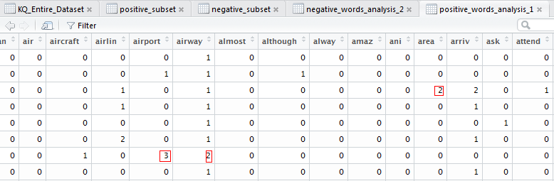
The above function transforms the data from its current raw form to a matrix form for better representation of how many times a word appears in a document(each review in this case). Basically is the Term Frequency (TF) part. We then applied the function on the negative subset of the entire corpus.

dim(negative_words_analysis_2)
 [1] 181 286
 > negative_words_analysis_2 = analyseText_1(negative_subset$Review_name)
 > freqWords_neg = colSums(negative_words_analysis_2)
 > freqWords_neg = freqWords_neg[order(freqWords_neg, decreasing = T)]

The function extracted 286 words (1 per column) that are repeated with certain frequency across all negative reviews. We’ll have a look at them too in a short while.
The output is as below.

negative-words-matrix
A summation of their frequencies in a negative context is arrived at by issuing the below commands.

>freqWords_neg = colSums(negative_words_analysis)
> freqWords_neg = freqWords_neg[order(freqWords_neg, decreasing = True)]
> freqWords_neg[0:15]
The output is as below:-
flight nairobi kenya hour airway staff time
332       189   106   100   95     82   81
delay seat airline economy food passengers service
 77     77     76      68    63    63         62

“Flight” is the most common word in the negative reviews as well as “Nairobi”, “Kenya” etc in that order. That was expected as most customers will make reference to the flight they were taking to Nairobi (destination/connection port for Kenya Airways). The entity to note is “hour” and “staff”. Going through the reviews paints a picture of delays and not very friendly staff on the negative side. On the contrary, it’s also possible to find the same aspects on the positive side of the reviews. One man’s meat is another man’s poison.

positive_words_analysis_1 = analyseText_1(positive_subset$Review_name)
 > dim(positive_words_analysis_1)
 [1] 257 219

In the 257 positive sentiments, the most frequent words were 219.Some words e.g. “flight” dominated both subsets.

> freqWords_pos = colSums(positive_words_analysis_1)
 > freqWords_pos = freqWords_pos[order(freqWords_pos, decreasing = T)]

positive-words-matrix

A side by side word cloud representation of the evident words in the negative and positive reviews respectively is as below. The size of the word correlates to its frequency across all the reviews.

rplot01

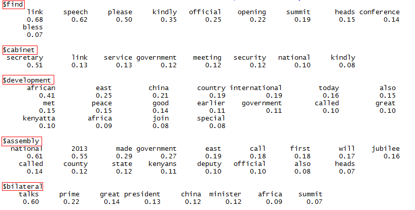
The final part is in finding associations between words, both in the positive and negative subsets.  For example, what word followed e.g. “flight” or “staff” in the two subsets.  This will give us a better idea of what aspects KQ can look at to improve. We’ll, therefore, look at the words correlated to the top 10 most frequent words in each of the subsets.  Correlation is put at 70%.

>neg_words = analyseText_3(negative_subset$Review_name)
> findAssocs(neg_words, c(“flight”, ‘staff’,’delay’,’food’,’service’), .07)

negassociations
We repeated the same procedure with the positive subset of the data. Correlation is still at 70%.

> pos_words = analyseText_3(positive_subset$Review_name)
 > findAssocs(pos_words, c("flight", 'time','crew','food','service','seat','customer'), .07)

posassociations

posassociations1

Conclusion

I’m sure you now have an idea of why the KQ story had to be told this way. We got data, wrangled it to a form understandable by the computer and presented the final findings. It’s NOT upon us to give ways forward on what the management of KQ needs to do as the data to some extent speaks it loud. It’s up to the firm to work on the negative aspects. We shall continue to analyze datasets from other airlines that fly the Nairobi route to know why they are performing better if not worse compared to KQ. We also do not rule out analyzing data from other disparate sources e.g. social media accounts of the airline that are rich with user feedback. Keep following us and hey we are happy to receive your feedback.